Wednesday, 19 October 2011

Survey Results


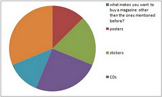
This graph shows the results that were collected and it also indicates that most people would be more tempted to buy this magazine if it has a CD in front of it. However other people would also want other gifts so I would have to do different gift packs every month to keep consumers happy.


 2 This graph shows that would people would prefer to have this magazine released monthly so to keep them happy this is what the magazine would have to do


This graph shows the results collected and it indicates that most people would like biographies included rather then the other s shown in the graph however results that were collected in had shown that most people ticked more then one box. This means I would have to include all types of articles.


The group of results show that the majority of people are willing to pay up to £2 so for me to satisfy the consumers the magazine shouldn’t be any higher then £2 pound.


This graph shows that that most people would prefer to hear British news and international music news instead of having one or the other. So here i would have to include both types of news to enable my magazine to make all consumers happy.


This graph of results show that most people would like articles and promotions to be included in the magazine however there are consumers that wouldn’t what promotions included so I would have to included promotions and articles most times but not always.
Contents Page Analysis
T
he contents page for NME is dominated by a large central image.
This is because they recently reformed for summer shows and this was the first time since then that the band has been pictured together. This expresses to me that the magazine is aimed at teenagers. The second image which is shown on the contents page is small image in corner, of a snapshot of January’s edition of NME. The members do not have a direct mode of address, the magazine seems more laid back; this suits the target audience who are mainly teenagers who share this ethos.
The colours and fonts used follow the conventions of the front colour. The contents page follows the house style of the magazine, with the text being the same as the title block. This creates a more stylish consistent magazine, if there were different fonts and various different colours the magazine would look amateurish.
The information in the magazine is organised in the left hand section of the magazine in alphabetical order of artists. Which is more useful compared to other magazines that have the name of their articles on the contents page, NME tells you the page where you can find the artist. This helps the reader to access the artists that they are interested in; it gives the target audience freedom to decide what they want to read. This tells the audience that the magazine has gone back to basics to make the reader feel like they can easily access the articles in the magazine.
The contents page also expresses a promotional offer of getting the magazine for ‘85p’ per issue if you subscribe. This allows the target audience feel like they are getting a good deal, as it is aimed at young males who don’t have a much disposable income.
The magazine logo appears up in the corner of the contents page. As it is a small image, this shows that the magazine wants to portray that the artists are more important than their brand. The promotional offer also contains ‘NME’ in bold, this is the only time that the magazine title has dominance on the page.

Front Cover Analysis

Double Page Spread Analysis
The artist that features in the NME article is Gerard Way, lead singer of the band My Chemical Romance. The famous bands recent album (released four years ago) The Black Parade which was aimed at those who felt misunderstood or separated from everything around them mainly teenagers. The text used is a simple black font, which follows the house style of the magazine. It seems that you would have to read the whole article to understand what is going on because it has a few entry points.
The main image for the article is a close up of Gerard Way with the anchored text of ‘This record is going to be a grand failure if people don’t get it’, this is juxtaposed with the image as from the facial expression Gerard Way seems not so bothered the text however suggests otherwise.
The tone/theme of the article gives the sense that NME wants the reader to feel like the member of the in-crowd, they are parting information about something that has not yet been released yet. They also want the reader to feel as if they were a close friend; this is demonstrated through colloquial phrases and social words such as ‘Right’. However they treat the reader as if they were an informed fan as they talk about tracks from other artists albums like ‘Jenny was a friend of mine’ by the Killers. But the chances of an NME reader actually reading this article is slim as the artist may not appeal to all of them and they may not have the attention span to read such a lengthy article.
The language used in the article is mainly simple, it’s wrote in a formal fashion but is laced with colloquial phrases such as ‘chucked out their tunics’ and ‘honk the pop fact sirens’. This is because the article is informing the reader about the years that My Chemical Romance have been missing from the music scene but they aim to do it in a way that will keep the reader interested, teenagers don’t want the intelligence level of the writing to be too high because they will get bored or confused and opt to read another magazine.
The majority of the article is text rather than images; this is odd for NME as their readership is mostly interested in looking at montages of images rather than reading lengthy articles. The images show Gerard Way now and back on The Black Parade tour, this is to highlight to the readers that the band has changed from what it used to be. This could be a ploy to entice teenagers who didn’t like My Chemical Romance before to give them another chance because they are different now.

Wednesday, 12 October 2011


Front Cover Analysis
The central image is of Gerrard Way from My Chemical Romance, NME wants us to feel like we have a relationship with him due having a direct mode of address. However, his body is twisted away from the camera and only half of his face is on view, this suggests that NME wants to create an element of mystery around Gerrard Way, they want us to know him but not the whole of him.
Gerrard is on the front cover due to the upcoming release of My Chemical Romance's new album. NME can take advantage of the huge fanbase of the band who will buy this new issue simply because Gerrard Way is on the cover. NME can also draw in a bigger readership as Gerrard is talking about their new album; My Chemical Romance have'nt released an album since 'The Black Parade' went platinum in 2006.
It sees its self as more as a newspaper than a magazine, as the title suggests, and reports on the latest gossip in the music world.
The title block tells us that the magazine is attempting to attract the youth with its bold lettering, the pointed 'M' also suggests that the magazine is 'cutting edge' and can offer new music to its young readers. The colours are also very bold which is something that the readership seeks as they search for who they really are. The title is also pronounced 'Enemy' which connotes the readership attempting to 'stick it to the man', it also suggests that the magazines enemy is popular culture, with this being the same enemy as the readership.
His edgy haircut and dark make-up could reflect his character; it makes him appear like a Vampire. This is strengthened by his facial expression and studio lighting. The colour theme of this cover is black, red and white. These are very dominant and powerful colours that would appeal to the male target audience; they also fit in with the consistent colours of the title block to compose the magazine cover and glue all the factions together using the same colour theme.